Serif or Sans Serif on a Long Printed Page?
Serif or sans serif on a long printed page? Compare real proofs for reading comfort and tone, then choose type that suits your text, paper and readers.
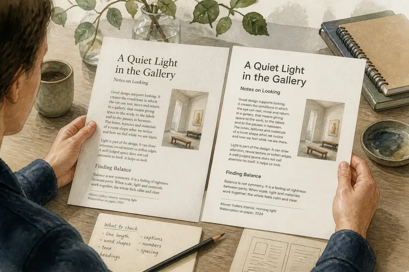
The common mistake with serif or sans serif on a long printed page is choosing from a screen preview; the cost is a typeface that feels cramped, tiring or out of place in print. Compare both in the actual layout, on suitable paper and with the same passage, before settling on one.
Start with the page
Gather a representative passage, the intended paper and a draft of the page. Include a long paragraph, a short one, a subheading and any captions. Uniform placeholder text can hide awkward line breaks and the points where the page becomes tiring.
Print the draft at its intended size. A face that looks graceful when enlarged on a monitor may appear cramped in a column, and fine details may lose clarity on textured stock. If the exact paper is unavailable, use a similar coated or uncoated sheet and treat the proof as an initial reading.
Keep the comparison fair: use the same text, column width, leading, margins and ink colour in both versions. Change one factor at a time. Otherwise, you will not know whether a difference comes from the typeface or the layout.
Read tone and texture
Serifs are the small finishing strokes at the ends of many letterforms. Their shape, contrast and spacing can give a page a literary, editorial or traditional character, but no single impression applies to every serif. A sturdy slab serif feels different from a delicate old-style face.
Sans serif faces omit those finishing strokes. Their page texture may seem open or direct, but a tightly set sans serif can look dense, while a well-spaced serif can feel airy. Judge whole lines and paragraphs, not isolated letters in a specimen.
Notice whether words clump, repeated shapes make lines monotonous, or spaces within and around letters remain clear at the intended print size. The right face supports the text’s voice without repeatedly drawing attention to itself.
Compare printed proofs
Make two versions of the same spread, using ordinary text styles rather than display cuts. Set the faces at a comparable size and weight, then print them side by side.
Read each version at a comfortable distance. Mark interruptions: a crowded line, a hard-to-recognise word shape or a heading that attracts too much attention. Do not judge solely by which face looks fashionable.
Return to the pages after a break and read a longer passage in each. If others will use the piece, ask likely readers to do the same without telling them which face you favour. Ask what felt easy to follow and what tone they noticed; treat their responses as clues, not a vote.
If one face repeatedly disrupts reading, adjust its size, spacing or line length before rejecting it. Print the revision and compare again. If the difference is mainly tonal, choose the voice that suits the text and its setting.
Match type to use
Imagine you are designing a printed guide for a local gallery. The essays are reflective, while labels need to be scanned quickly by visitors standing near the work. You try a restrained serif for essays and a clear sans serif for labels and navigation, then print a spread. If the shift feels deliberate and the labels are easy to scan, the pairing serves distinct purposes; if it feels disjointed, try one family with different weights or sizes instead.
A single family can cover several roles if it has suitable text, italic and bold styles. That keeps the page coherent. A serif and sans serif pairing can make the distinction between long reading and short instructions clearer, but each change should help readers recognise a change in purpose.
Consider where the page will be read. Close, seated reading differs from a leaflet carried outdoors or read while standing. If the paper is rough, the type is small or the light may vary, inspect letter shapes and spacing under those conditions when possible. A strong typographic voice cannot rescue a layout that is hard to follow.
Reader questions?
Are serifs easier to read in print?
There is no universal winner for every reader or page. Compare the actual faces, size, spacing and paper, since they work together to shape reading comfort.
Can sans serif work for a book?
Yes. A well-designed sans serif can suit long printed text when its letterforms, spacing and page rhythm feel comfortable. Print a substantial passage before deciding.
Should headings use a different typeface?
They can, particularly when a second face clarifies the difference between reading and navigation. A change in size, weight or case within one family may provide enough contrast without adding another voice.
How should I handle conflicting feedback?
Ask readers what they were reading and where the page interrupted them, rather than which font they prefer in the abstract. If comments point to different uses, consider a measured pairing; if they point to the same awkward line or unclear label, revise that feature and print a fresh proof.
Check the final proof
Once you choose, check body copy, headings, captions, page numbers and small-print notes for accidental shifts in weight or spacing. Read a complete spread, not just one paragraph. Serif or sans serif on a long printed page is not a contest between categories; the decision depends on the texture, tone and reading conditions your text needs.
Keep the rejected print beside the final proof. If the paper or layout changes later, compare them again and decide whether the original choice still suits the page.